It’s a common conundrum in the web world. A designer puts a beautiful website together that the client is absolutely rapt with and hands it to the SEO to get it ranking who sheepishly tells them that it needs a bunch of changes. It’s almost like pretty sites just aren’t rankable sites. Well fortunately that’s not the case. Joe from Orange Digital has put together a list of helpful hints to ensure that your pretty website is still as SEO friendly as any.
1. Web Fonts are Your Best Friend
There’s nothing worse than being handed a website that has no crawlable information. If everything is displayed in images the Google bot (and others) can’t read it. Your amazing design is virtually unrankable. 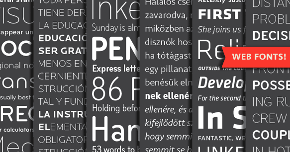 By using a combination of CSS, HTML and web fonts you can almost always reproduce the same effect that you get by displaying information with an image. Not only will your content be crawlable, but it will also be able to be marked up with metadata, meaning your awesome header graphic could also be the H1. If it were an image that wouldn’t be the case. Furthermore if you create a graphic using this method as opposed to an image, editing it is a cinch. If you want to change the text, colour, size or any other styling, you don’t have to pull the graphic back into Photoshop to change.
2. Copy Is Important
 Those minimalist highly visual, low word count designs might look great, but for SEO purposes they are incredibly counterproductive. Google needs content to work out what the website is about. Sure your metadata does some of the job but Google is a completionist and good copy indicates digestible information for the end user. Google’s algorithm is all about sending their users to results they can trust. If you want to retain the minimalist approach then the solution could be to hide the copy behind mouse-overs, however it may be worth questioning whether doing this pits aesthetics against usability.
3. Assume the Need For Drop Down Menus
The amount of times that I as an SEO have come across a WordPress site that doesn’t have properly designed drop down menus (or worse still doesn’t have them at all) is absurd. It’s a WordPress default function! The first live version of the website may not need them but just assume that down the line they will be needed and include them please. Drop down menus are an important part of site architecture from an SEO purpose as it allows you to internally link in a way that looks good and is natural, and the trends with design right now leaves no choice for SEOs but to create internal landing pages to rank. We need Google to be able to access them from other parts of the website and the top menu is the best place for it because…
4. Google Reads Like A Person
That means it reads from left to right and top down. The information that is higher on the page is assumed to be more relevant. If there is no crawlable information anywhere near the top of your page, the information that is crawled is assumed to be not important enough to show your users immediately. So that means that if you build a website that you have to scroll to before you get to the first part of the copy, the copy is SEO weak. At least try to include some crawlable information high on the page.
5. Ajax Content IS Crawlable
There once was a time when Ajax content was difficult, and in some cases impossible to crawl. Thankfully Google figured it out. It does involve tweaking. You can read more about the process here.
6. Consider Your SEO Friends
It’s basically just something to live by. If the website you’re designing has even the potential to ever need SEO, do right by your client and yourself by considering future need for SEO. Don’t just assume because it’s not your concern that it’s not a concern at all and never will be.


 By using a combination of CSS, HTML and web fonts you can almost always reproduce the same effect that you get by displaying information with an image. Not only will your content be crawlable, but it will also be able to be marked up with metadata, meaning your awesome header graphic could also be the H1. If it were an image that wouldn’t be the case. Furthermore if you create a graphic using this method as opposed to an image, editing it is a cinch. If you want to change the text, colour, size or any other styling, you don’t have to pull the graphic back into Photoshop to change.
 Those minimalist highly visual, low word count designs might look great, but for SEO purposes they are incredibly counterproductive. Google needs content to work out what the website is about. Sure your metadata does some of the job but Google is a completionist and good copy indicates digestible information for the end user. Google’s algorithm is all about sending their users to results they can trust. If you want to retain the minimalist approach then the solution could be to hide the copy behind mouse-overs, however it may be worth questioning whether doing this pits aesthetics against usability.